/ 68 FNL SEPTEMBER 2007
SAY IT WITH ACRYLIC
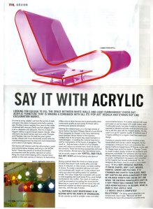
LOOKING FOR COLOUR TO FILL THE SPACE BETWEEN WHITE WALLS AND LIGHT FURNISHINGS? CHECK OUT ACRYLIC FURNITURE THAT IS MAKING A COMEBACK WITH ALL ITS ‘POP-ART’ REGALIA AND STANDS OUT LIKE EXCLAMATION MARKS.
It’s time to bring ‘plastic’ out from the sin bin of style and give it the place it enjoyed some half a century ago. Exciting colours ranging from neon to the solids combined with sinuous curves and fun shapes make it all so desirable and attractive. And no, it doesn’t happen without a good enough reason. Acrylic, often referred to by brand names such as Lucite, Perspex and Plexiglas, has over the last few years gotten harder, clearer and more structurally sound while the manufacturing process has become more streamlined and is able to hold tighter tolerances.
Get daring with interiors with this ultra-modern, swish and coloured show stopper and bring in the WOW factor! These star pieces of furniture and limited accessories work like prolific injections of colour lifting the mood while keeping with a neutral colour palette on the main canvas of interiors. Its fascinating toffee colours draw the eye and a good quality piece could easily qualify as eye-candy for those with a promiscuous pictorial sensibility!
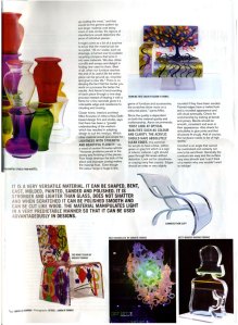
Harking the material back on to the high streets of home fashion has been Philippe Starck’s Louis Ghost Chair designed for Kartell. In the many intervening years between Verner Panton’s first injection molded chair to the present day, experimentation in methodologies in handling the material have lent it well for manipulation at the hands of designers. The result is…that we have a whole lot of fun shapes, sizes and colours to choose from. And it is not just the furniture. There are exciting accessories and even funky artworks. Almost every big international name has an acrylic range to offer: KARTELL, B&B ITALIA, BLU DOT, SEGIS and Inmod being only some of them.
During a period when the trend is to have accent furniture that doesn’t look exactly alike, one odd piece of coloured, or clear acrylic, can add a dollop of drama. To create a storyline add your own spin and coordinate with ‘acrylic art’ in pop colours and make your place the polling station for aesthetic trends. The colour range that is possible with acrylic is mind boggling and could easily throw usual design combinations into conflict. Too much of it and you could be accused of corrupting the monochrome. Balancing is crucial and it is the one factor that will determine whether an interior becomes gaudy or uber-chic, with the use of acrylic.
The MATERIAL’S EASY MAINTENANCE IS IN KEEPING WITH THE TENETS OF MINIMALISM.
Acrylic stands up well to sunlight, water and other environmental factors. It is easily cleaned with soap and water or can be wiped with a soft cotton cloth. Traditionally acrylic has been known to cloud when exposed to abrasive solvents such as ammonia and this is still the case with its cheaper grades. So the catch is to go for superior quality of material even if it means settling for a regular (read less expensive) design.
Contrary to popular belief acrylic furniture is also handcrafted and can be custom designed. As the companies continue to churn out production line pieces California based Aaron R Thomas works with his design team out of his studio in Orange County to create modern acrylic furniture for architects and designers worldwide. For someone who has had a lifelong relationship with the material (his father was an acrylic craftsperson) his passion and conviction for the material can be well understood. Yet, for designers like Aaron, love for acrylic is not a mere fancy. “IT IS A VERY VERSATILE MATERIAL. IT CAN BE SHAPED, BENT, CAST, MOLDED, PAINTED, SANDED AND POLISHED. IT IS STRONGER AND LIGHTER THAN GLASS, DOES NOT SHATTER AND WHEN SCRATCHED IT CAN BE POLISHED SMOOTH AND CAN BE CUT LIKE WOOD. THE MATERIAL MANIPULATES LIGHT IN A VERY PREDICTABLE MANNER THAT CAN BE USED ADVANTAGEOUSLY IN DESIGNS. WHAT IS MORE IS THAT ACRYLIC OVER 1.5 INCHES THICK IS COMPLETELY BULLETPROOF.” On being asked about the cost components, Aaron says, “Because we build everything by hand, the production process ends up costing the most,” and that would be the general pattern by and large: material cost being more or less similar, the rigours of manufacture would determine the price of individual pieces.
It might come as a bit of a surprise to know that the material can be re-cycled. “All our waste, such as shavings, is turned over to a plastic recycling company that turns it into new materials. We also utilise cut-offs and scraps and delight in finding new uses for them. Best of all, when our furniture reaches the end of its useful life the entire piece can be ground up, recycled and given a new life.” There is no denying the fact that the harder you work on a process the better the results. And Aaron’s hand-sanding of each piece through a nine-step process instead of heating it with a flame for a few seconds gives it a noticeable edge and resistance to clouding and crazing.
Closer home, interiors architect Mike Knowles of Inline a New Delhi based design firm and studio, says that there has been a “greater understanding of the medium which has resulted in adapting design to suit the medium. Which other material would give scope for LIGHTNESS WITH STRENGTH AND BEAUTIFUL FLUIDITY.” As a word of caution Knowles admits: “However problems persist in the joinery and finishing of the pieces. Poor finish destroys the look of the piece and improper joining makes the material float. Even though the colour range is huge in this
genre of furniture and accessories, the scratches show more on a, coloured piece,” warns Mike. Since the quality is dependent on both the material quality and craftsmanship, Aaron recommends, “FIRST LOOK AT OPTICAL QUALITIES SUCH AS COLOUR AND CLARITY. THE ACRYLIC SHOULD HAVE ABSOLUTELY CLEAR EDGES. It is common for acrylic to have a blue, yellow, green or grey tint which is a sign of inferior material. Light should pass through flat areas without distortion. Look out for cloudiness or crazing (very fine cracks). Edges should be crisp or very slightly rounded if they have been sanded. Flamed edges have a melted look and a rounded appearance and will cloud eventually. Check for workmanship by looking at bends and joinery. Bends should be smooth, consistent and even in their appearance. Also check for airbubbles in glue joints and that all pieces fit snugly. And of course, the hardware needs to be of high quality.”
Comfort is an angle that cannot be overlooked and certainly not one to be sacrificed. Generally the contours are easy and the surface very very smooth and I can’t think of a reason why one wouldn’t want to indulge!


