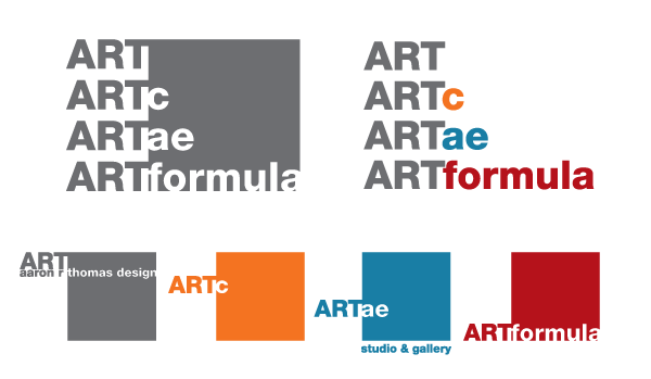
After consistent growth in almost all directions we decided that we needed a logo that encompasses all of our divisions in a unifying manner. We wanted something that says who we are visually and denotes the things that we stand for as a company:
Well thought out design
Minimalist
Fun
Versatile
Strong
Straight Forward
Highest Quality
Outside the box (<— Sorry! We also hate overused cliches like this also.)
Good at what we do
Fairly priced (We don’t waste your money on advertising because we don’t need to)
Cohesive
Unified in what we stand for
I know I’m forgetting a few things but hopefully the new logos will remind you of the things I’m leaving out.
